V-Ship is a B2B freight startup I co-founded, serving small to large businesses across Canada. Unlike parcel delivery, V-Ship handles commercial shipments — skid-loaded warehouse freight, loading dock pickups, and container haulage. Before building the platform, I spent time in the trenches — managing freight dispatch, coordinating drivers, and maintaining client relationships day to day. That operational experience shaped every design decision I made.

My Role
• Founding Product Designer (sole designer)
• Owned end-to-end design: UX, UI, branding, and workflows
• Collaborated with founders and external development team
• Brought firsthand operational knowledge as a former dispatcher and client coordinator
The Problem
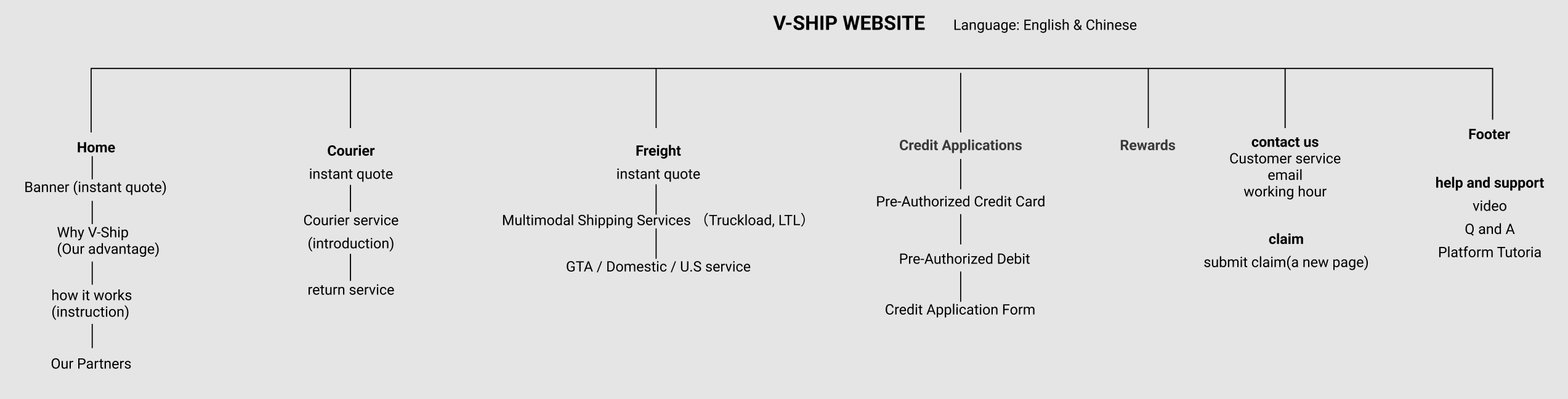
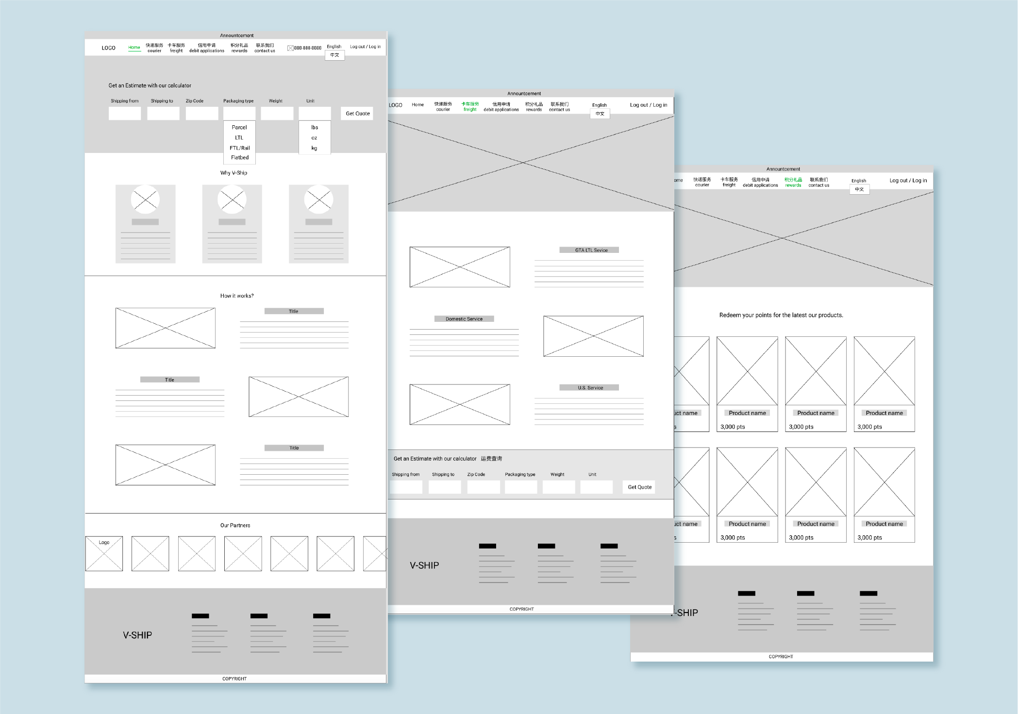
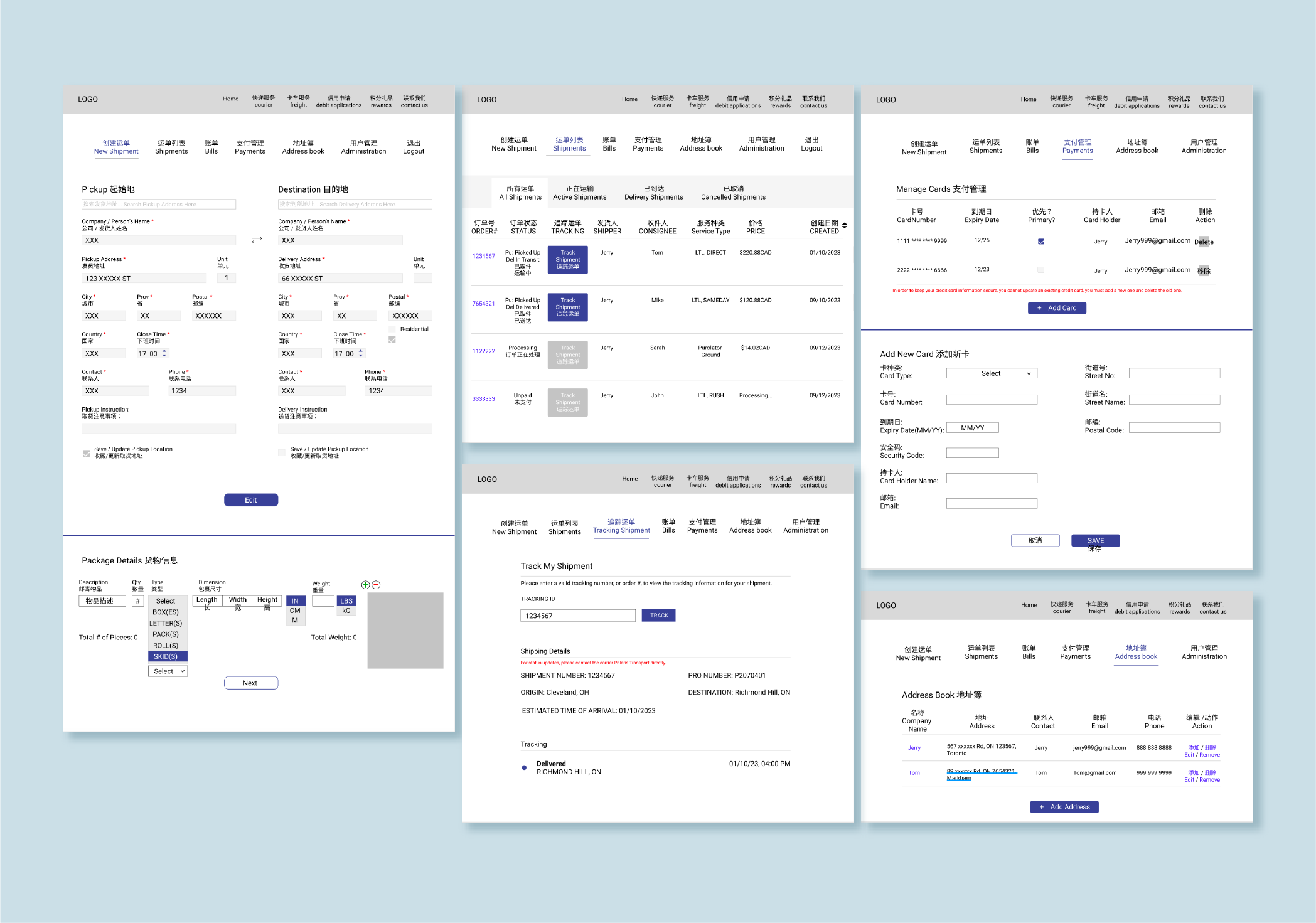
Before the platform existed, the entire operation ran on phone calls, WhatsApp, WeChat, and a shared Google spreadsheet. It worked — until it didn't.
As the person managing dispatch, I lived with these frustrations daily:
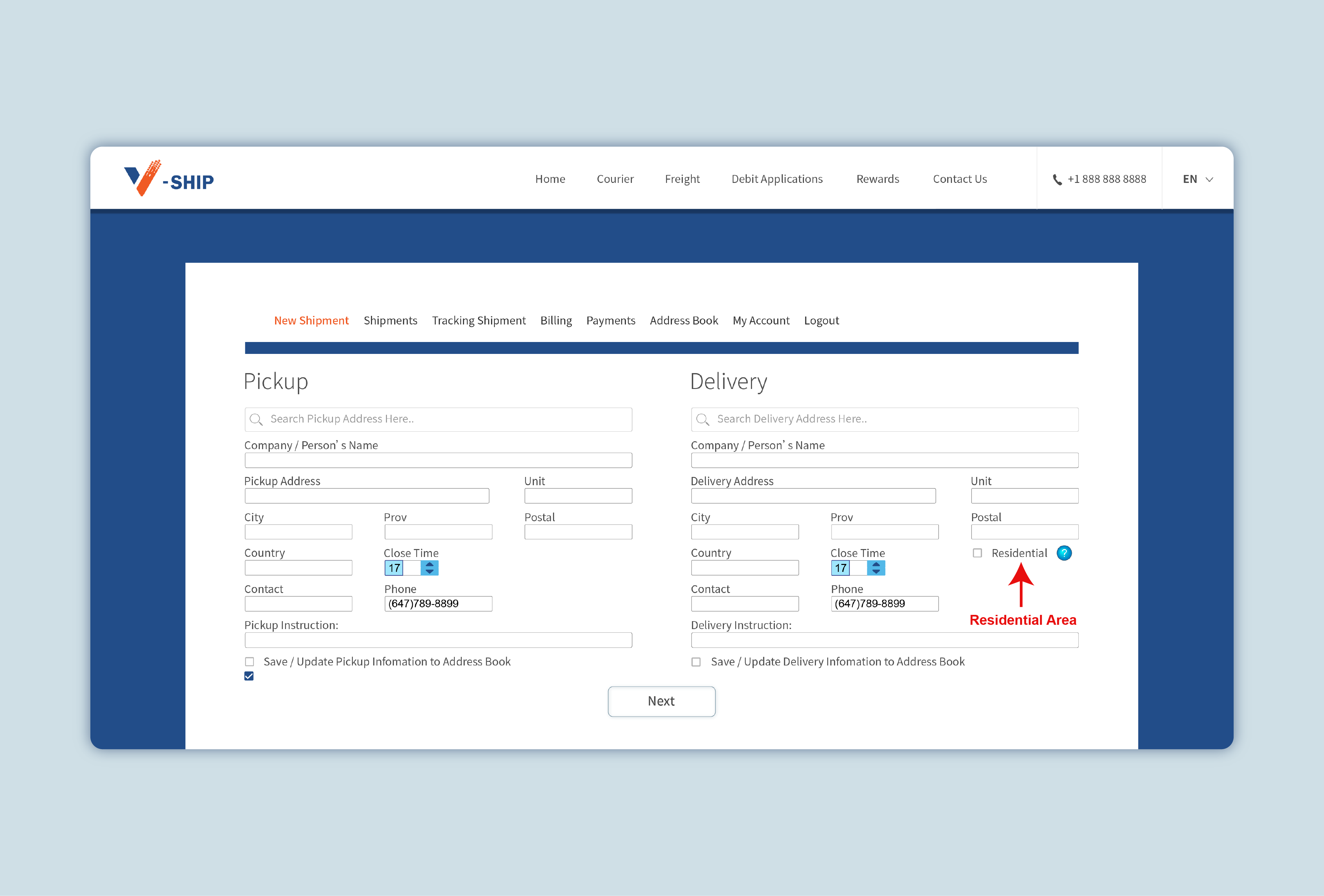
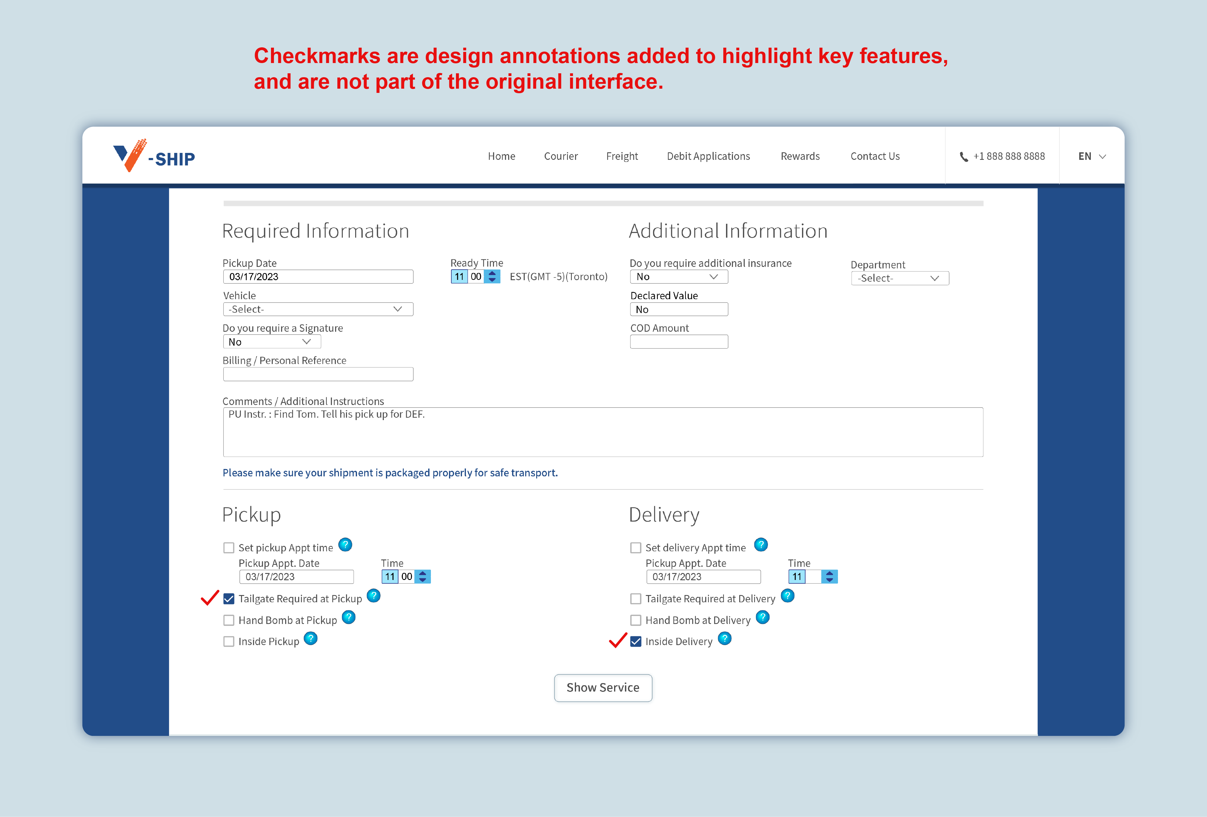
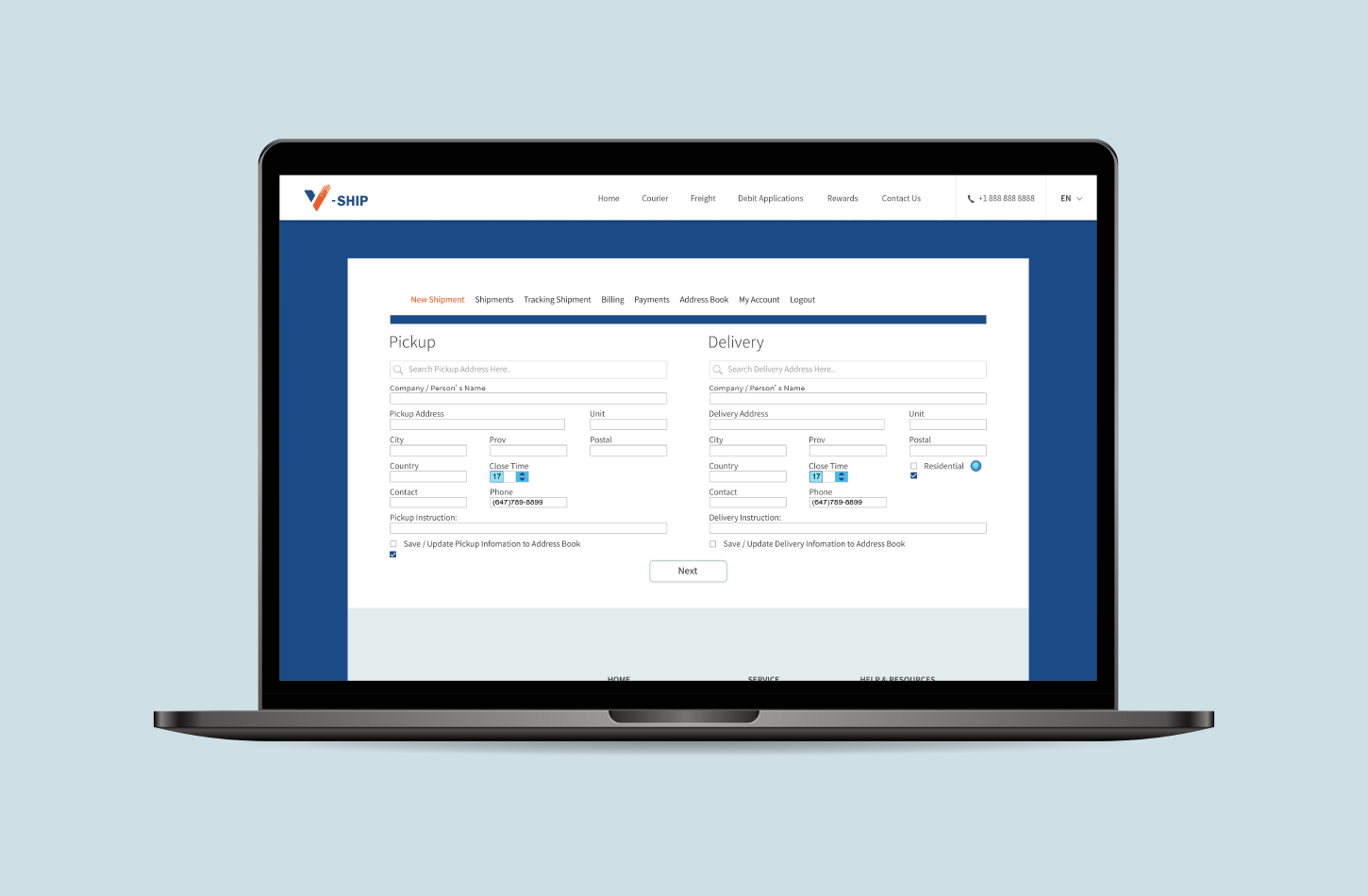
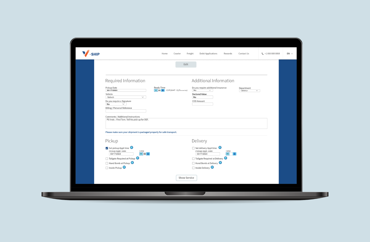
  • Order notes kept getting longer because there was no structured way to capture special requirements
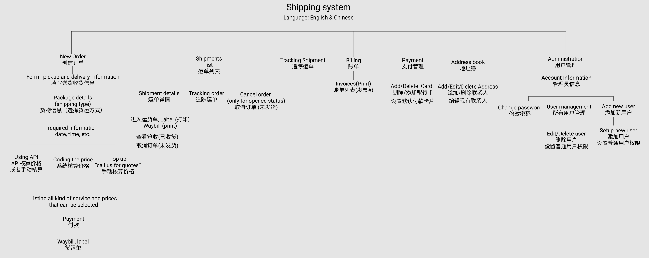
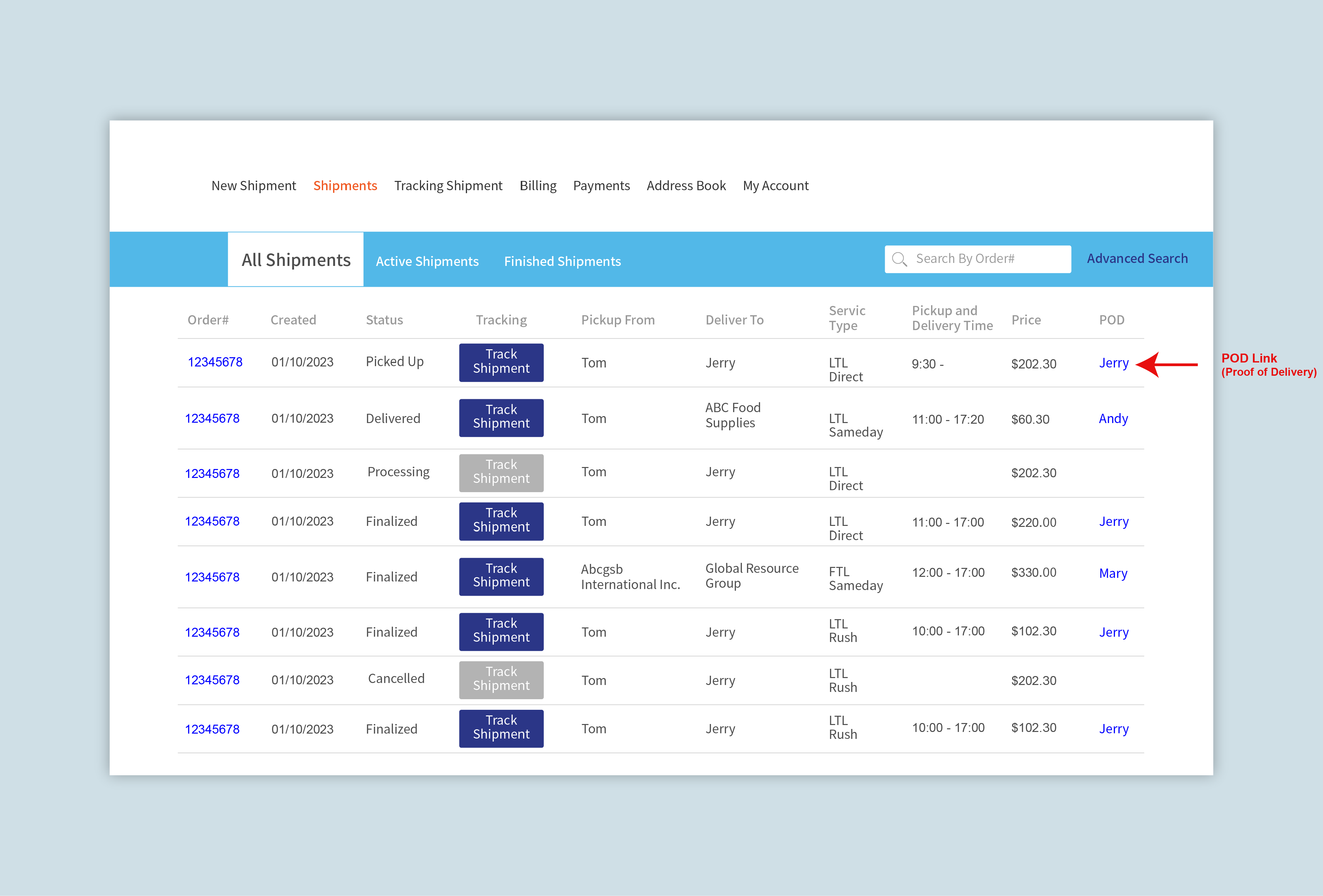
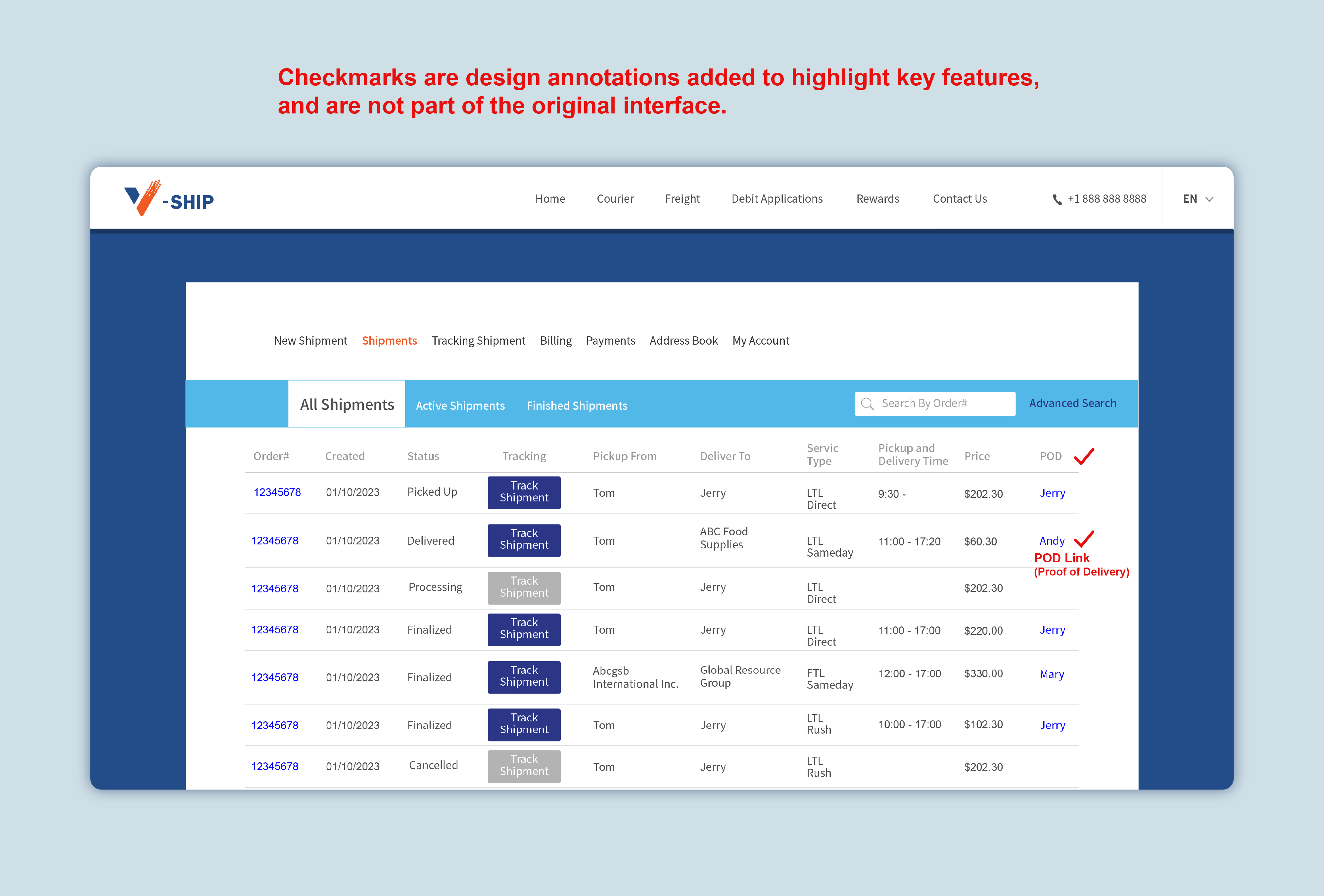
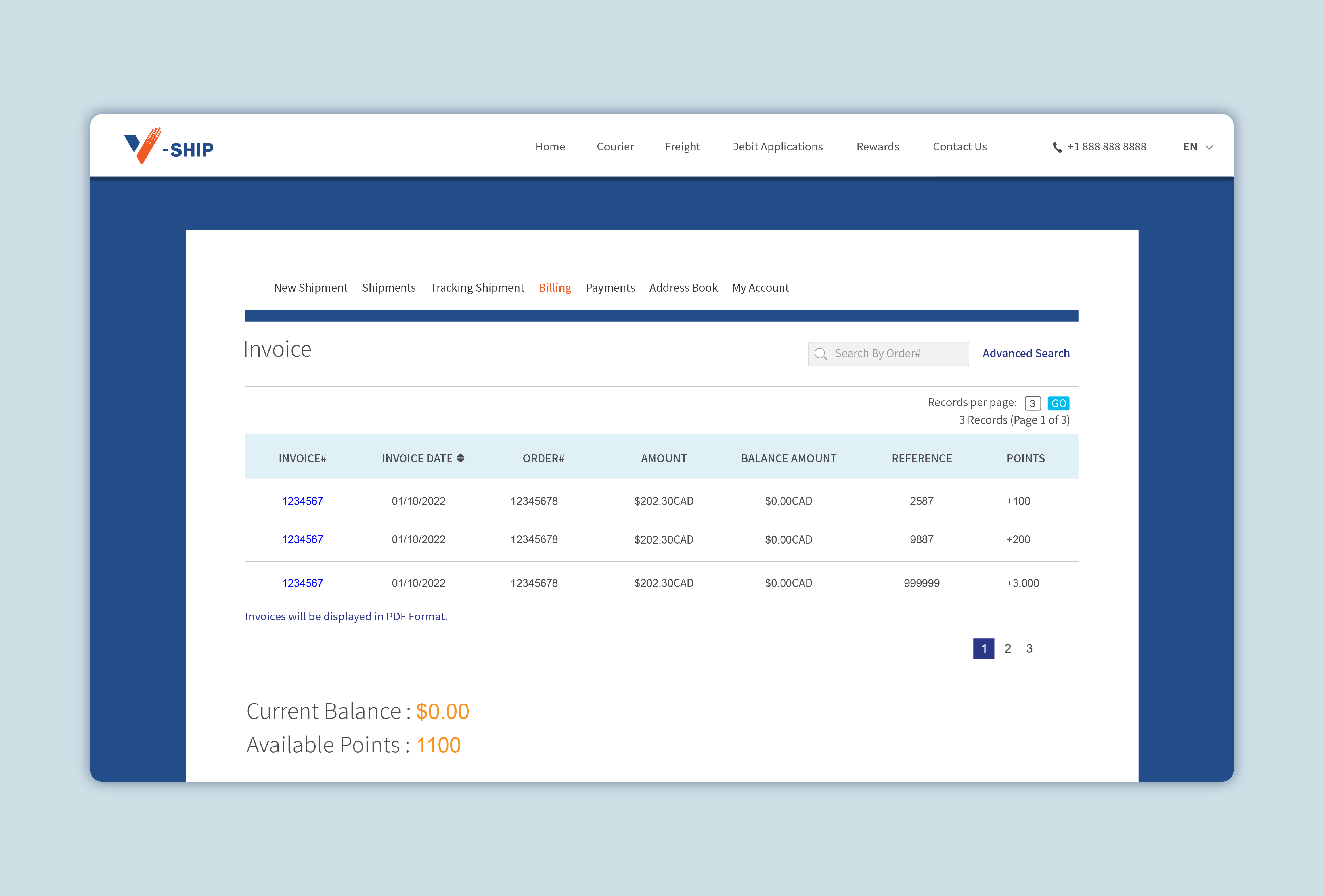
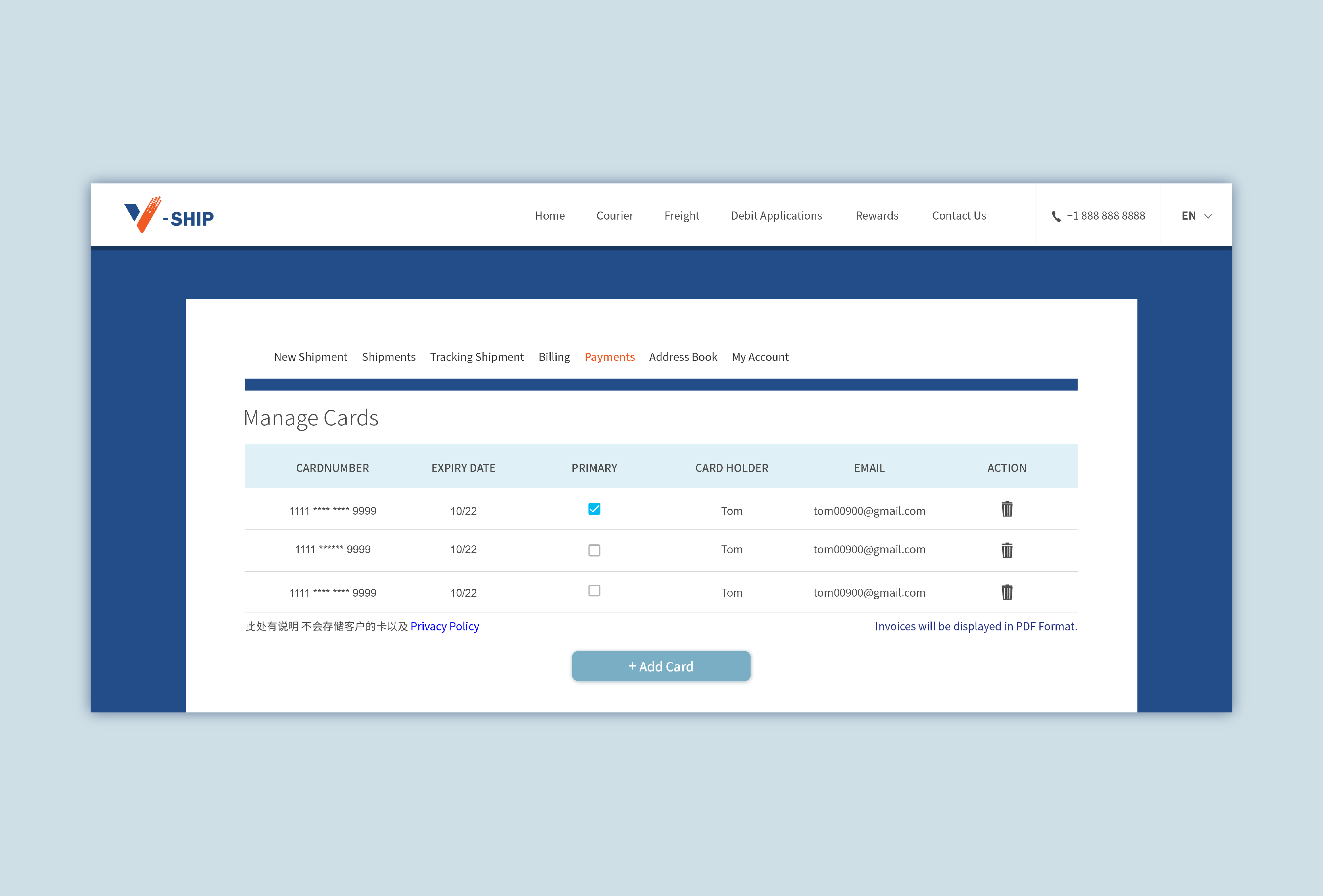
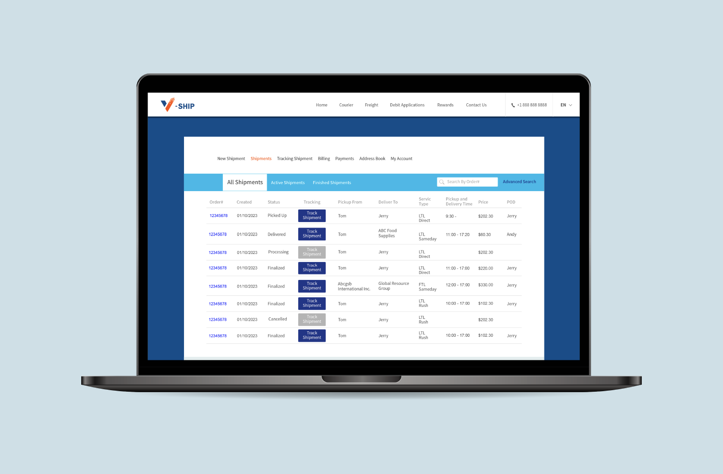
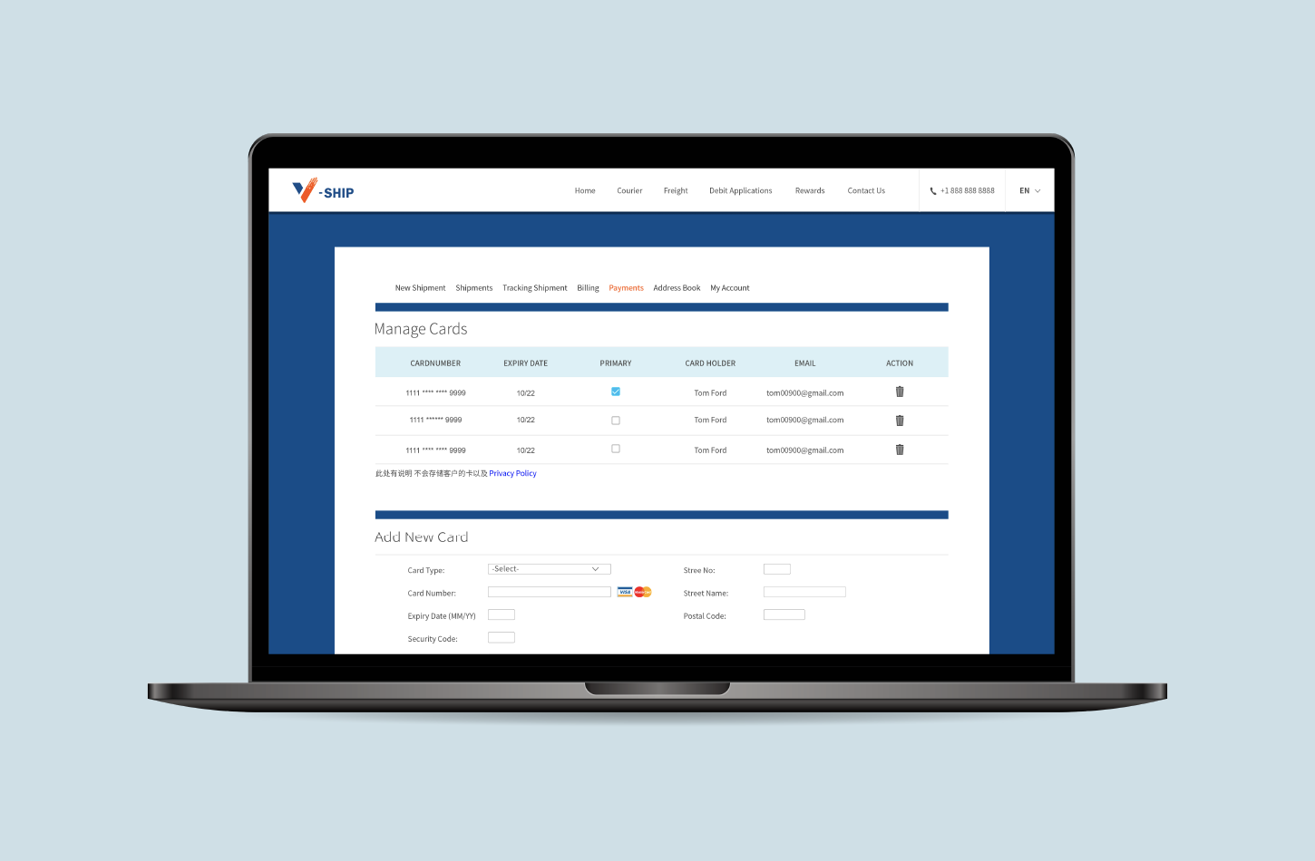
  • Invoices and orders had to be reconciled manually — payment records for both clients and drivers were tracked by hand, which led to errors
  • Any unexpected change meant a new round of calls and messages
On the client side, I noticed recurring pain points through daily conversations:
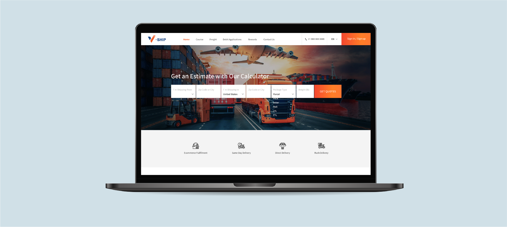
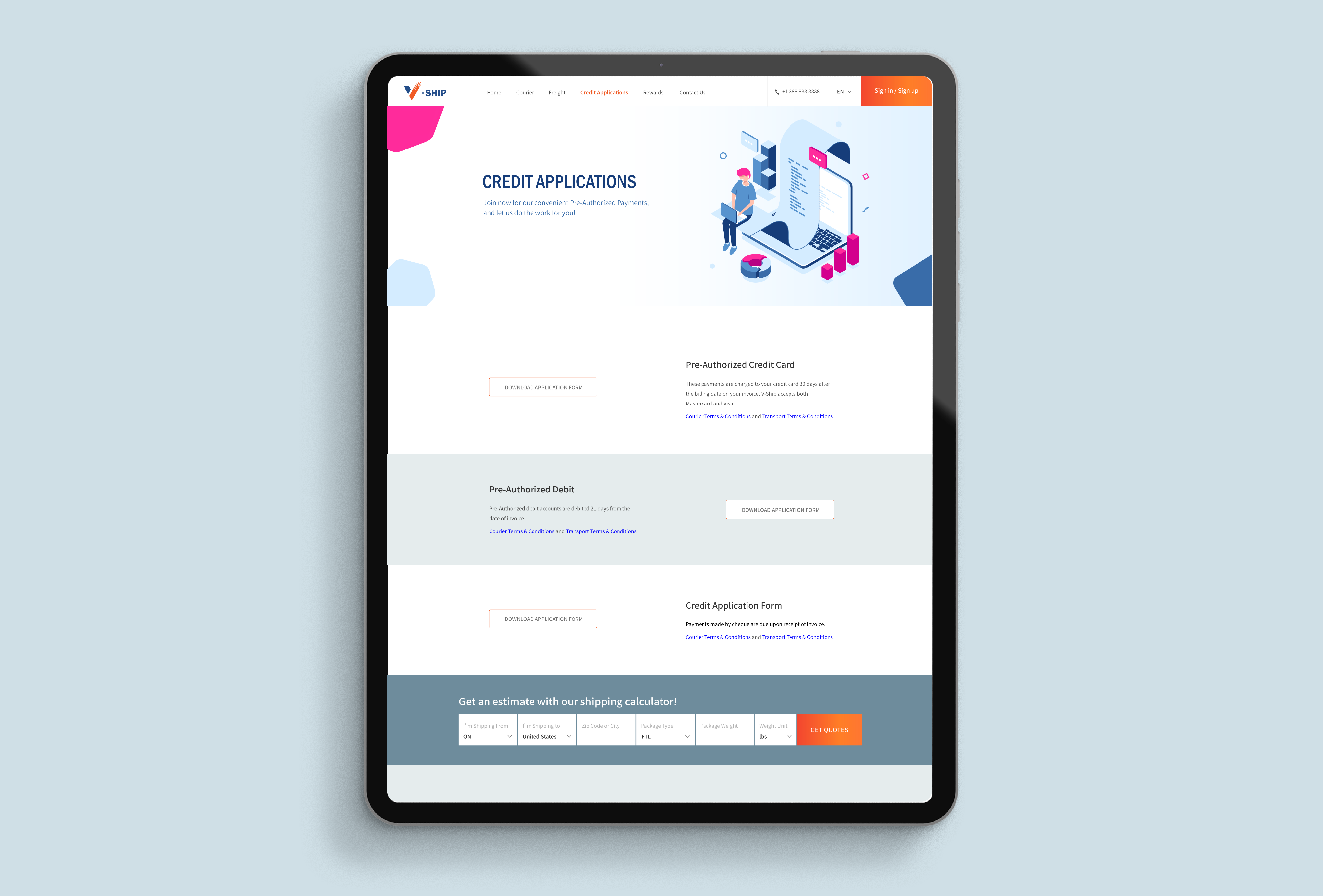
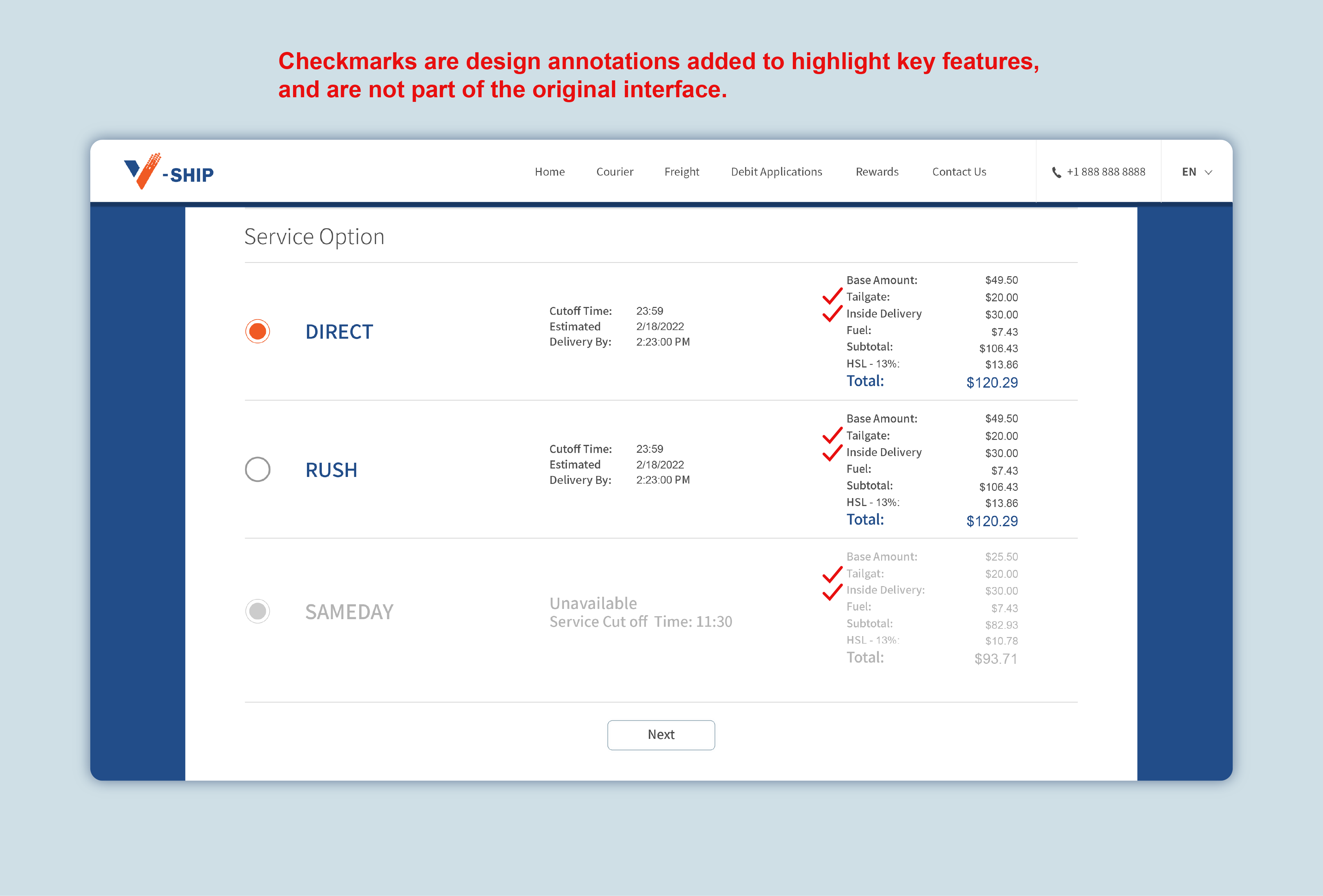
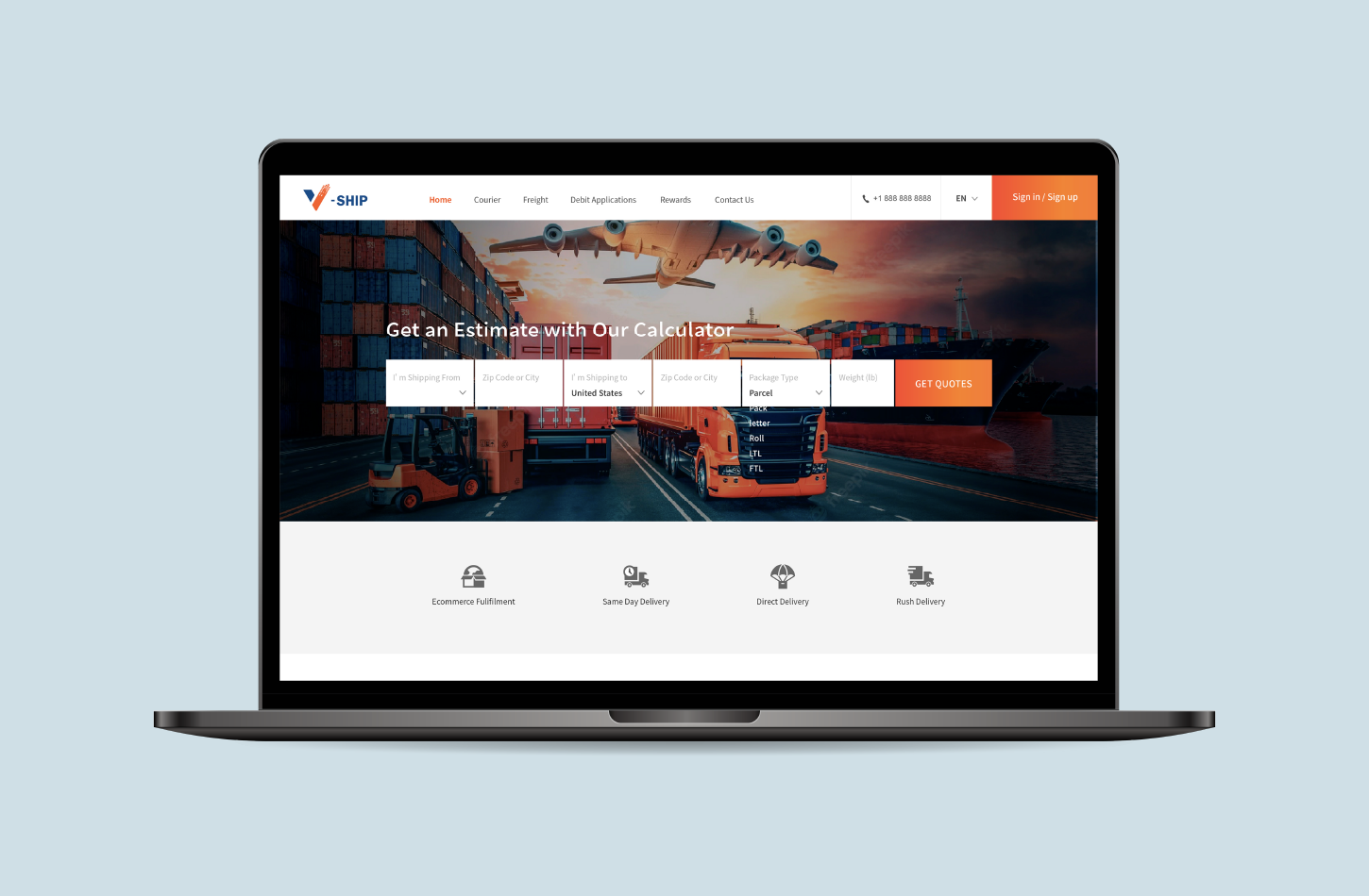
  • Pricing — Clients wanted clear, upfront quotes with no surprises
  • Time sensitivity — Many needed deliveries before business hours ended, or at specific times like after hours or weekends
  • Visibility — Clients frequently asked about their order history and had no way to check themselves
  • Special handling — Some clients, particularly restaurants and bubble tea shops, needed drivers to help move goods past stairs or tight spaces
  • The tailgate gap — Many clients didn't realise their location lacked a loading dock and needed a tailgate truck. They wouldn't think to ask — so I designed the system to guide them before they even knew it was an issue
A Problem I Didn't Expect
Two incidents changed how I thought about delivery records.
In one case, a client came back two weeks after delivery to say their customer never received a large item shipped to a private residence. We resolved it with a timestamped photo the driver had taken inside the customer's garage.
In another, a warehouse claimed non-receipt weeks later. We located the signed proof of delivery and were even able to describe the person who signed for it.
Both times, we had the evidence. But it was sitting on drivers' personal phones — one device wipe away from being gone forever.
This made one thing clear: delivery proof couldn't live on a driver's phone. It needed to be in the system, accessible to clients without them having to ask.
Each completed order displays a POD (Proof of Delivery) link — clients can download their signed delivery confirmation at any time, without needing to contact us.
Business Tensions
Not every problem was purely a UX problem. Some required balancing user needs against real business risk.
New clients needed to pay upfront — we had experienced walk-aways after a single delivery. But long-term clients often operated on informal credit, sometimes going over a month without settling.
The solution: established clients can apply for a pre-authorized payment arrangement — choosing between credit card or debit, with billing cycles of 21 or 30 days after invoice. The application form is downloaded, completed, and submitted to us for approval. The client proposes a preference; we make the final call.
Design Goals
Pain Point Design Response
Unstructured order notes Structured order form with built-in options for special requirements
Manual invoice reconciliation Automatic billing linked to order completion
Clients unaware of tailgate needs Guided selections during the ordering flow
No visibility into order history Client-facing order tracking page
Delivery proof at risk of being lost Clients can access signed delivery photos anytime
Payment risk with new clients Upfront payment required by default
Informal credit with loyal clients Debit application system with company-controlled approval
Wireframes
Presentation pages - The main pages of the website showcase freight services and features.
Menu: home, courier, freight, debit application, rewards, contact us.
Shipping system - The shipping system is accessible to logged-in clients only.
With the pain points clearly mapped, I moved into the system's wireframing. The priority was structure and flow clarity — getting the logic right before adding any visual polish.
UI Showcase
Note: The shipping system is accessible to logged-in clients only. The following screens are from the client-facing platform after login.
• The order form was one of the most important design decisions. Rather than relying on a free-text comments field — which was how special instructions were handled before — requirements like residential area, tailgate, hand bomb, and inside delivery became individual checkboxes at both pickup and delivery points. Clients could also set specific appointment times directly in the form. This structure reduced miscommunication and made edge cases visible by default, instead of buried in a notes field.
• Once the form is completed, available service options are displayed with fully itemised pricing — base amount, tailgate, inside delivery, fuel surcharge, and tax — so clients know exactly what they're paying for before confirming the order.
• The tracking shipment page meant clients no longer needed to contact us to check on orders. This alone removed a significant volume of routine enquiries.
• After delivery, the signed proof is stored in the platform. Clients can pull these up anytime — no chasing required.
• Invoices are generated automatically upon order completion, linked directly to the corresponding order record. No more manual reconciliation.
• The Payments page allows established clients to manage their saved payment methods — adding credit or debit cards, setting a primary card for billing, and removing outdated ones.
Final UI
• Simplified complex logistics into step-by-step flows
• Prioritized clarity over visual complexity
• Designed for edge cases, not just ideal scenarios
Challenges
• Designing for multiple user types — business clients, drivers, and internal staff — each with different needs and levels of tech comfort.
• Translating messy, real-world logistics into clean digital workflows without losing the nuance that operations actually require.
• Working with an external development team under uncertainty, which meant my designs needed to be detailed enough to survive handoff without me in the room.
• This case study focuses on the client-facing experience. Driver and admin interfaces were also designed as part of the full system.
What I Learned
Running the business before designing the product was uncomfortable in some ways — I had too many opinions and had to actively challenge my own assumptions. But it also meant I never had to guess at the user's pain. I had lived it.
The most valuable thing I took from this project is that good logistics software isn't really about logistics. It's about reducing the mental load of people who are already juggling a lot — and that trust is built through the quality of every small interaction, not just the big features.