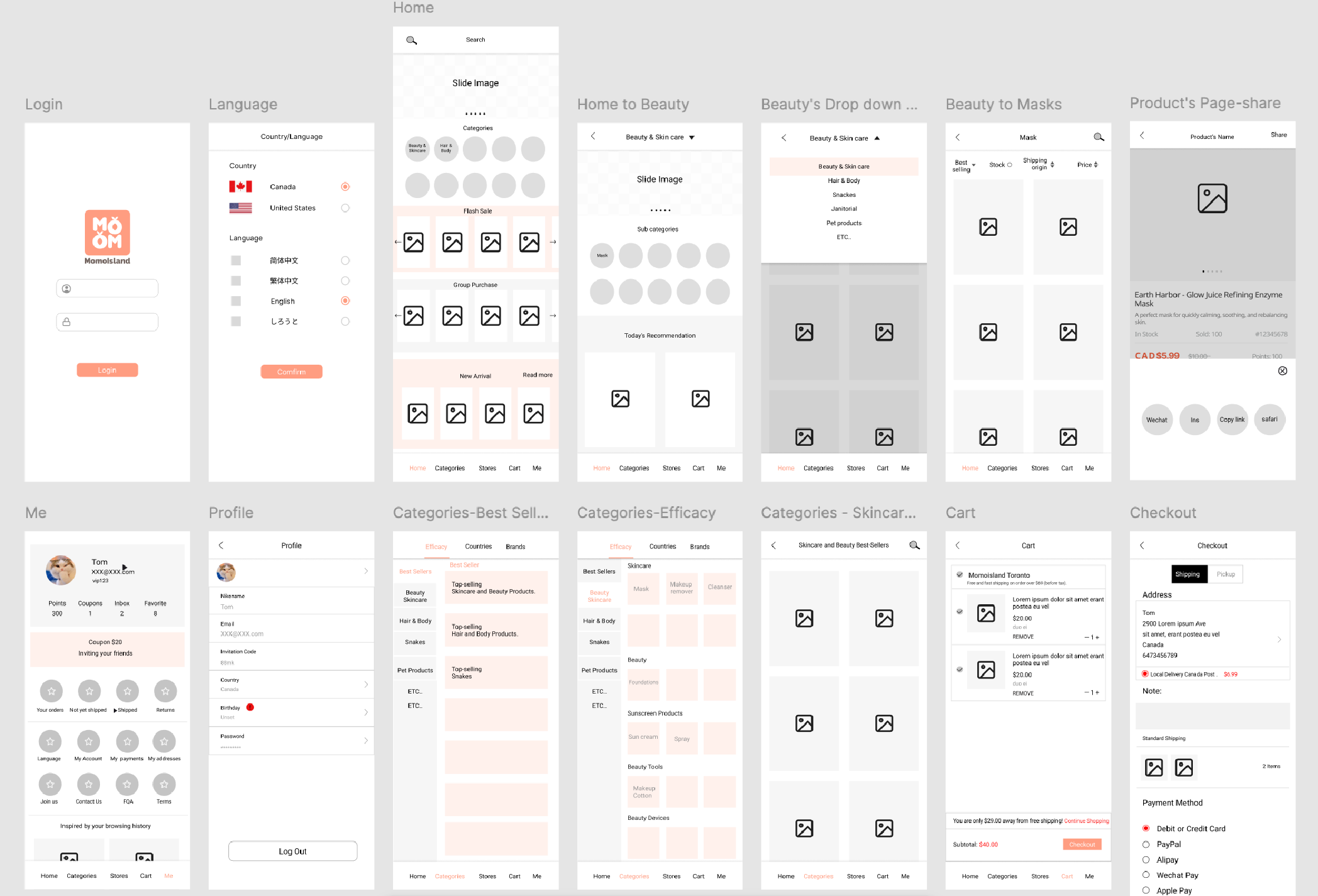
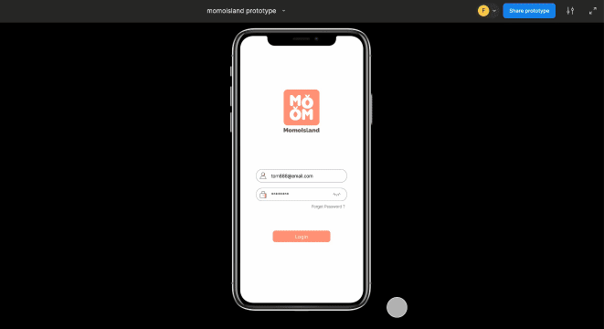
Momoisland is an e-commerce platform focused on selling Asian products to a primarily female audience aged 18–35. I joined as the sole designer with one brief: rebuild the entire app from scratch, in six weeks, for launch.

Problem
The mobile application was originally outsourced to an external vendor but failed to deliver a usable product within the expected timeline. The company required a complete redesign under a tight deadline to support the product launch.
Key challenges included:
• No functional or usable app experience at the time of takeover
• Lack of clear user flows and interaction structure
• Need to rebuild UX from scratch under time pressure (~6 weeks)
• Requirement to align product experience with a soft, brand-led visual identity
My Role
• Sole designer responsible for full UX and UI design of the mobile application
• Rebuilt product structure from workflow to final interface
• Designed brand mascot and emoji system from scratch
• Delivered complete design spec and handoff to development team
• Collaborated directly with the founder to align on brand vision and product direction
Understanding the Brand
The founder had a strong sense of the brand she wanted — soft, playful, and visually emotional. Her background in luxury cosmetics retail gave her an instinct for how visual identity shapes a customer's feeling about a product. The target user was a younger version of herself: fashion-conscious, emotionally driven, and drawn to cute, considered aesthetics.
That clarity was valuable. With no time for user research, the founder's vision became my primary design compass.
Brand Mascot & Visual Expression System
Brand Context
• peach-based brand identity
• target: young female
• usersneed emotional + playful tone
Mascot Design
The founder's only brief was "a peach, and make it cute." I took that as an open brief. I sketched several directions by hand, refined them, and vectorised the final character in Adobe Illustrator. The mascot became the emotional anchor of the brand — appearing across the app, marketing materials, and social content.
Emoji System
At the founder's direction, I extended the mascot into a full emoji set — expressive variations that carried the brand's personality into micro-interactions and social communication. This created a reusable visual language that went beyond the app itself.
Mapping / sitemap
Given the timeline, I kept the early process lean and focused. I mapped out the core user journeys an e-commerce experience needs to support:
  • Product discovery
  • Product detail exploration
  • Order tracking

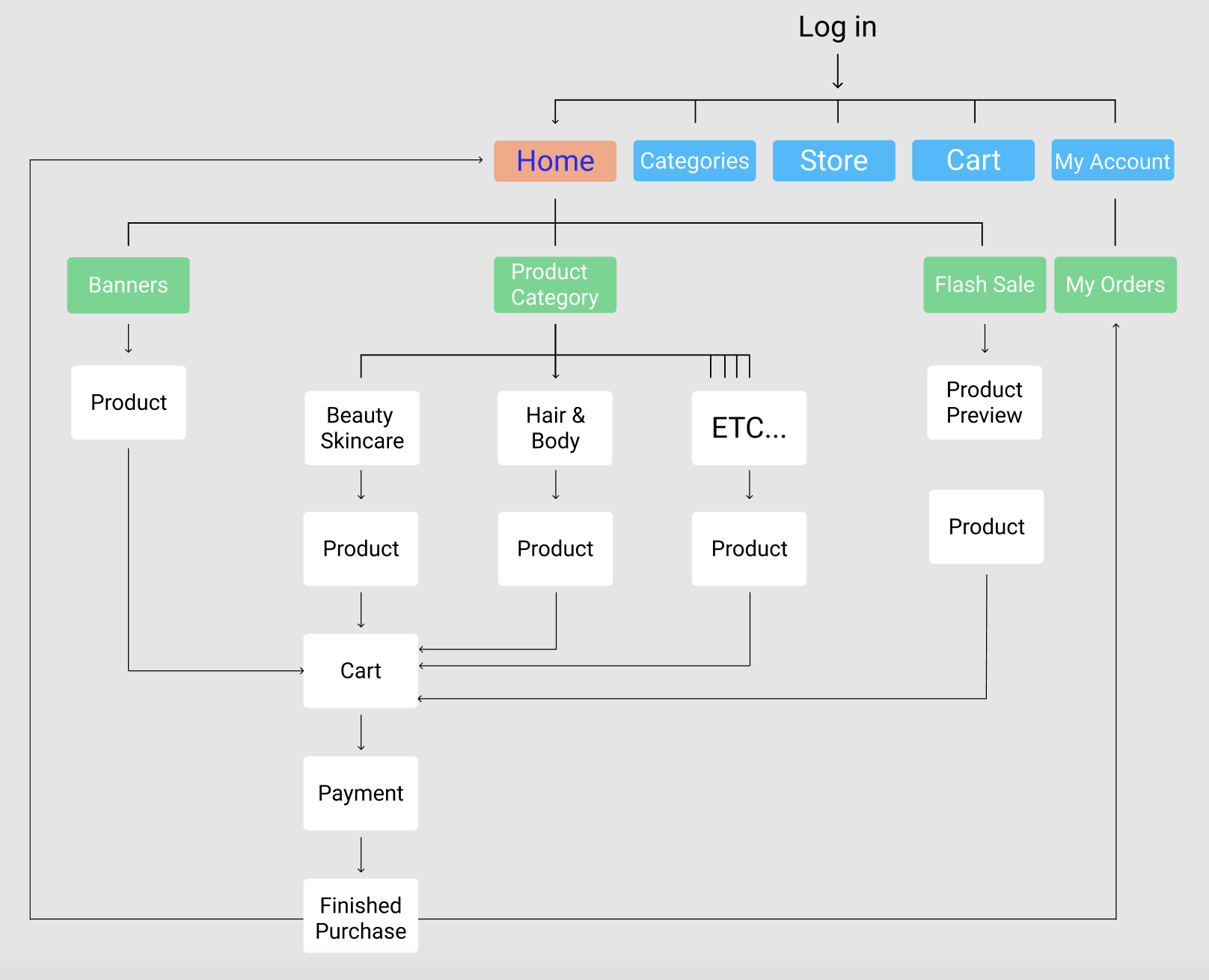
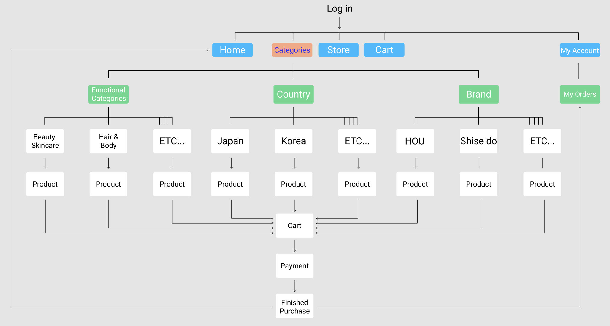
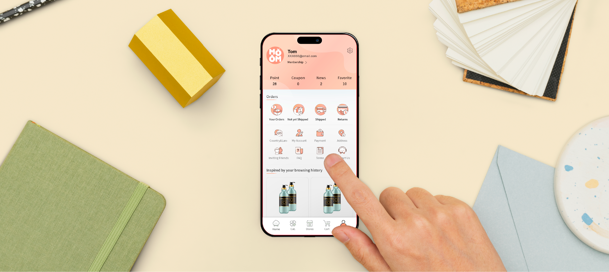
I referenced Taobao and Amazon — not for visual inspiration, but for how they structure navigation and checkout flows. Both platforms have been tested at massive scale. Borrowing their logic gave me a solid foundation to work from without needing to validate from scratch.

I was transparent with the founder about what we were trading off: speed meant skipping formal research and end-to-end testing. We both accepted that risk in order to hit the launch date.
Wireframes
With the flow mapped, I moved into low-fidelity wireframes to establish layout structure, navigation logic, and content hierarchy. The goal at this stage was clarity of flow — getting the bones right before adding any visual weight.
Find UI
The visual system was built around the brand's peach-pink identity — soft, warm, and playful. Icons, buttons, and components were designed to feel consistent and emotionally aligned with the brand while maintaining clarity for e-commerce usability.
Core flows were prototyped end-to-end: browsing products, adding to cart, checkout, and order tracking. This gave the development team a clear reference for interaction behaviour and transitions.
Honest Reflection
Looking back, there are two things I would do differently.
The brand's signature peach-pink was applied to primary buttons — a decision driven by the founder's vision. In hindsight, the contrast ratio against white text fell below accessibility standards, and the colour risked being confused with error states. Given more time and leverage, I would have pushed for a slightly deeper tone that preserved the brand warmth while improving legibility.
I would also have advocated harder for at least one round of usability testing before launch — even informal testing with a small group of target users. The timeline made this feel impossible, but the risk of shipping an untested flow is real. It's a trade-off I would approach differently now.
Delivery
The final deliverable included complete UI designs, a full design spec with spacing, typography, colour values, and component states, and a Figma handoff shared directly with both the development team and the founder.
The app launched on the Apple App Store. The company later closed for business reasons — but the project delivered what it set out to do: a complete, brand-aligned mobile experience, on time.
What I Learned
Constraints teach you to prioritise. Six weeks forced me to make fast decisions and commit to them — there was no time to second-guess every choice.
I also learned that a strong brand vision from a founder can be a genuine design asset, not just a creative limitation. Knowing exactly who the brand was for — and having a founder who embodied that user — gave me a clear direction when I had no time to find one through research.
What I'd carry forward is the importance of building in testing time, even informally. Shipping without validation is a risk. Sometimes it's a necessary one — but it should always be a conscious choice, not just a casualty of the schedule.